One nonprofit, four brands, and I designed the whole site.
Story of You is the parent organization. Under it are a foundation (The Healing Classroom), a tutoring and college-counseling program (SOY Academy), and a free STEAM program for elementary schools (Full STEAM Ahead). Families, schools and supporters all arrived at the same front door, and the site gave them no way to tell which part was for them.
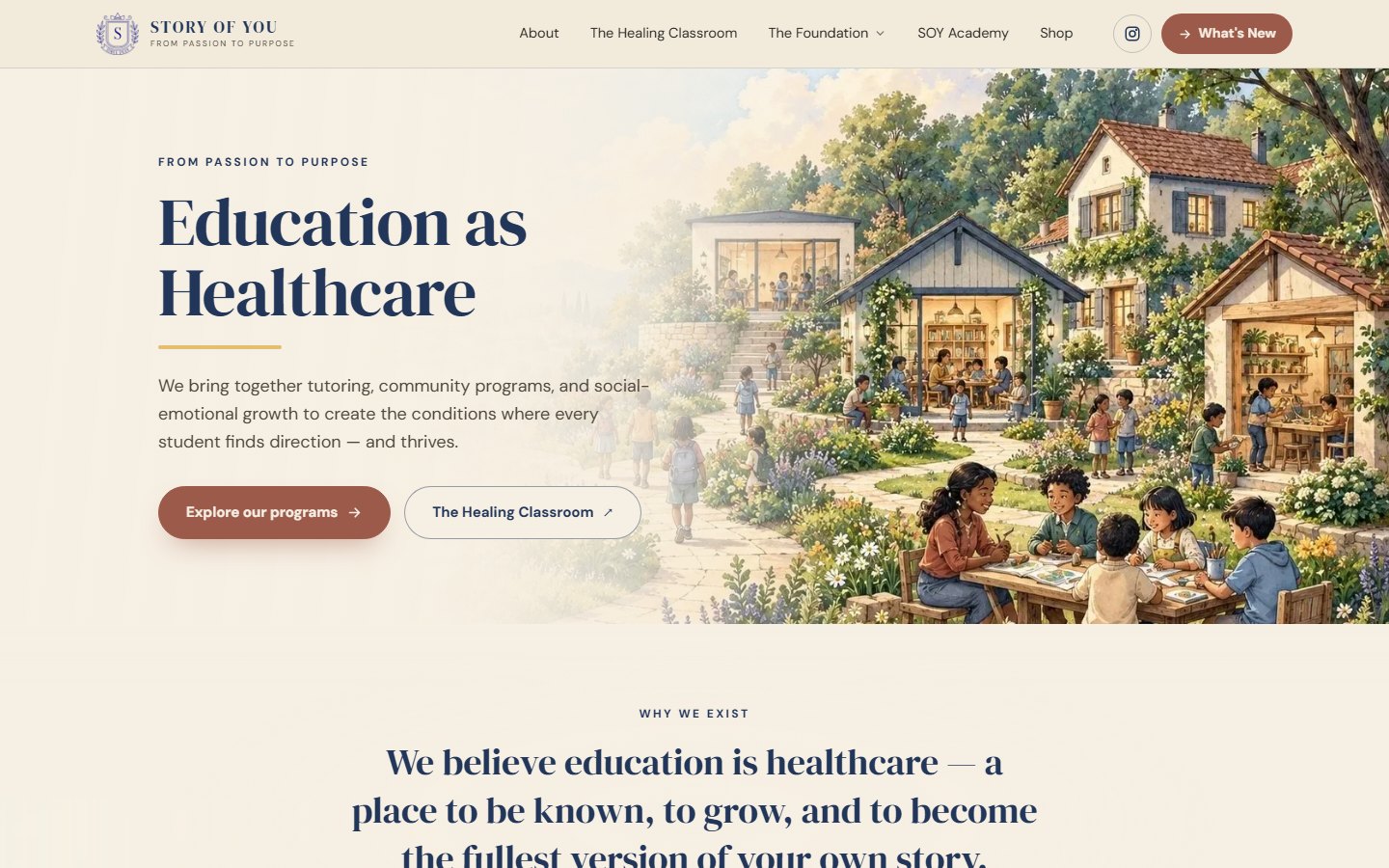
Drag the line to compare January with today.
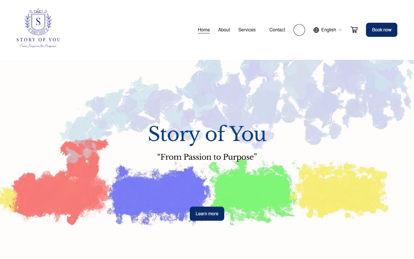
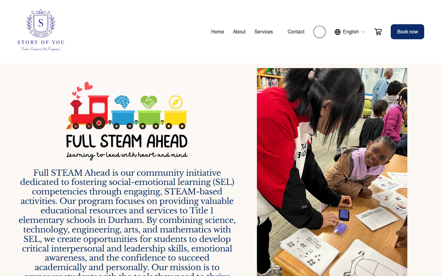
The "before" is the homepage as the Wayback Machine captured it on 14 January 2026, before I started. The hero said the organization's name and a tagline over paint splashes, with one "Learn more" button. Nothing explained what the nonprofit does, who it's for, or what to do next.
 Jan 2026Now
| Element | January 2026 | Now |
|---|---|---|
| First message | The name and a tagline | What the nonprofit does: "Education as Healthcare" |
| Calls to action | One vague "Learn more" | Two specific next steps: explore programs, or the foundation |
| Navigation | Home, About, Services, Contact, plus a shopping cart and a language picker | Grouped by what visitors came for: programs, partners, getting involved |
| Visual identity | Four bright paint colors, a script logo, three program logos in three styles | One palette and two typefaces shared by every program |
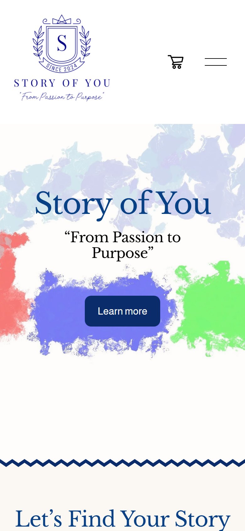
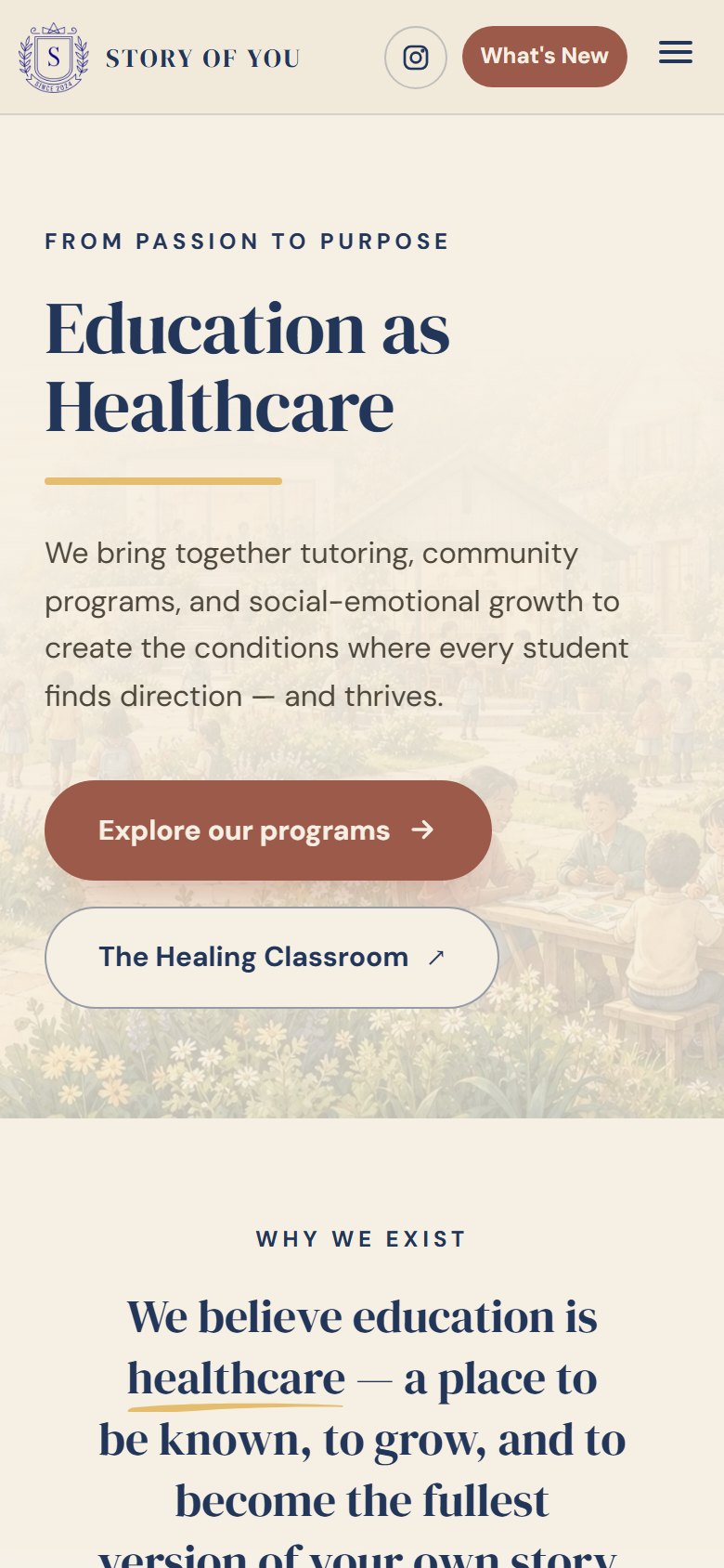
| Phone | The logo filled a third of the first screen | A compact header, with the message and buttons above the fold |
Transfers toClarifying a value proposition and primary actions on a landing page. Any product with more than one audience has the same problem.
I audited all 38 pages before redesigning any of them.
I listed every page from the sitemap and reviewed each one at desktop (1440px) and phone (390px) width, logging the same things each time: headings, missing alt text, broken links and leftover placeholder text. Then I ranked every finding by how much it hurt a visitor's trust.
- P0Broken promises. The footer newsletter form posted to a placeholder address, so every signup was lost. The tutoring program's terms, privacy and policy links all returned 404.
- P0Unfinished content. The About page showed gray placeholder avatars instead of team photos, and the homepage carried sample testimonials.
- P1Inconsistent brand. Four typefaces were loading across pages, and gold was used for text, where it is hard to read.
- P1Accessibility gaps. Pages had images without alt text, and some pages had no main heading for screen readers to land on.
- P2Voice. Title Case headings, buzzwords like "empower" and "journey", and past sponsors still listed as current partners.
Transfers toHeuristic evaluation, accessibility audits and severity-ranked backlogs, the same process product teams use before a redesign.
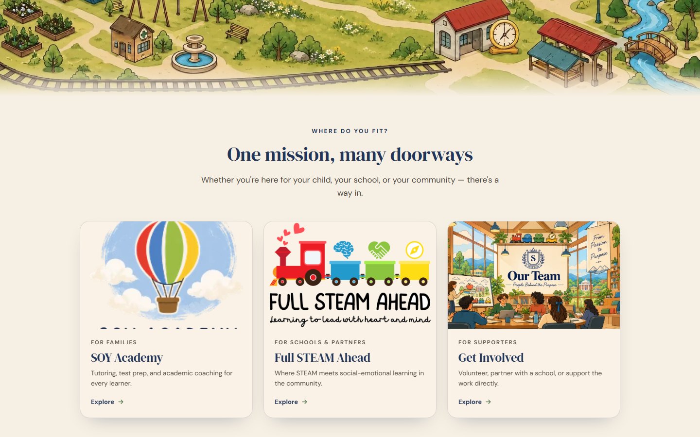
The homepage is organized around who is visiting.
Families, schools and supporters come for different reasons. Instead of making them learn the organization chart, the homepage gives each audience its own doorway, and the story of the whole organization stays in one place above them.
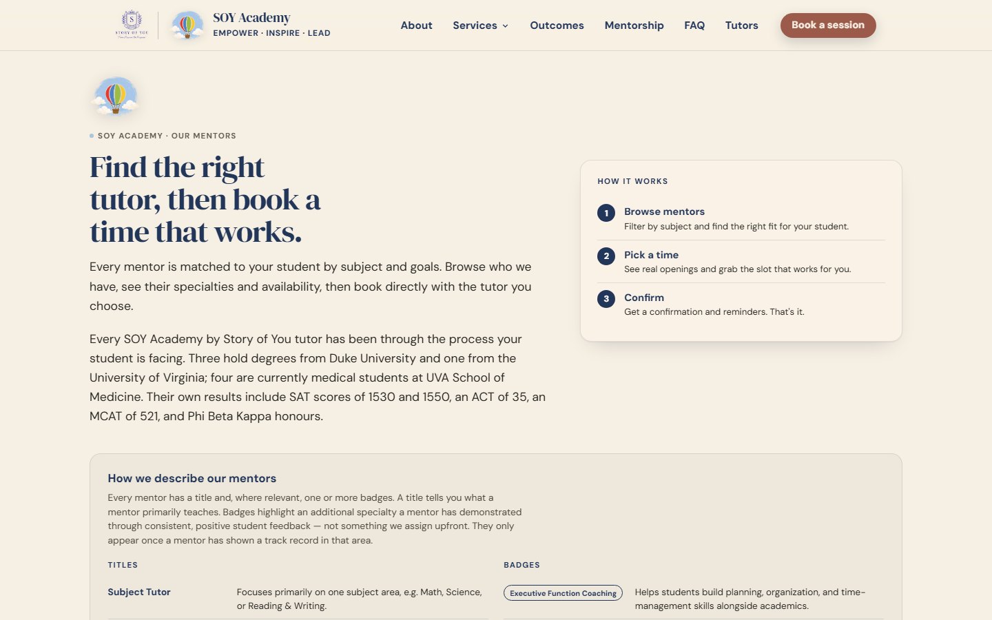
The tutor directory needed its own content model. Every mentor has a title for what they mainly teach, and can earn badges for extra specialties. Badges only appear once a mentor has a record of good student feedback in that area. A legend on the page explains this, so families can compare mentors without guessing what a label means.
Transfers toInformation architecture, audience segmentation and content modeling: deciding the rules behind a directory as well as its cards.
Does it feel like opening a well-loved storybook together?
That question was the test for every decision. If something felt loud, salesy, clinical or cluttered, it failed. I wrote the system down as a working kit: one palette for every program, two typefaces, a rule for how much accent to use, and a voice guide.
60 / 30 / 10: cream, navy and charcoal, then one accent that leads each piece.
Rebuilding 38 pages at once wasn't realistic, so I set the kit up as a site-wide switch. I could preview any page in the new style, fix what broke, and only then turn it on for families.
Transfers toBuilding and governing a design system: tokens, usage rules, and a safe way to roll changes out across an existing product.
Families can now book a session without emailing anyone.
In January, booking was a "Book now" button in the header. Now it's a page that explains itself. You pick a service from a row of cards, and the panel below shows what it costs, how long it is, and what to expect. The free consult comes first, for families who aren't sure what they need. The scheduler sits underneath, with a link to open it in a new tab if the embedded version won't load.
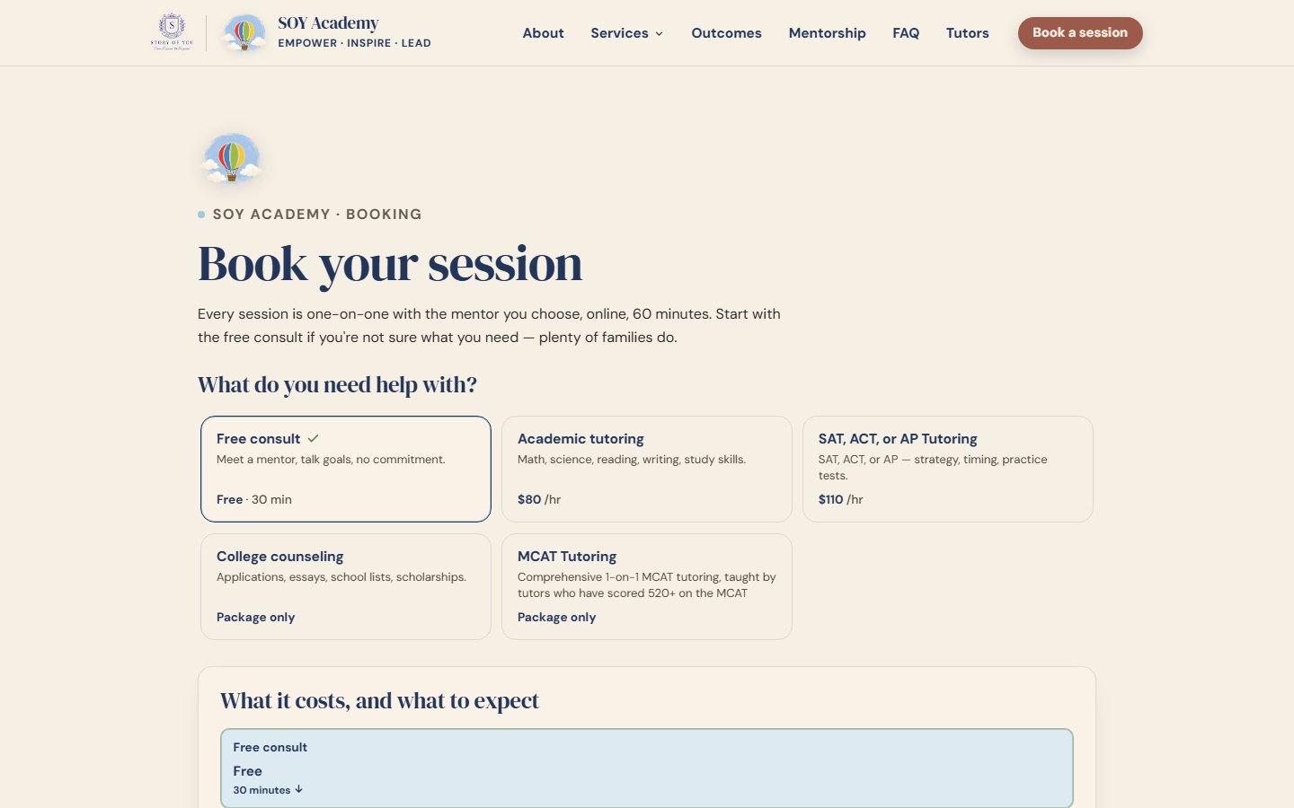
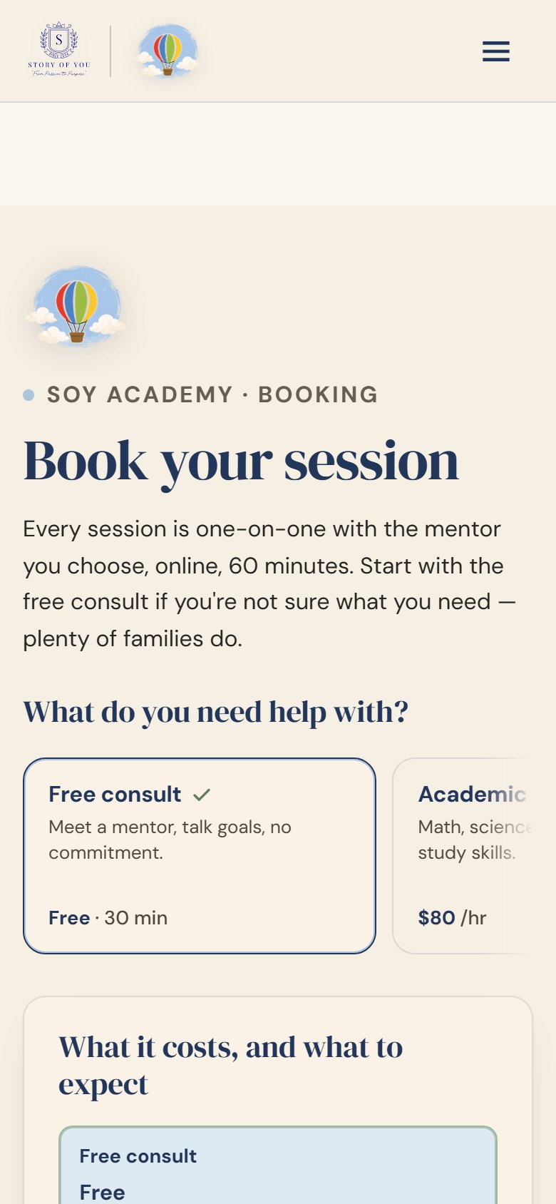
I designed every state the page can be in, including the ones that go wrong:
The tutors page and booking page are linked. Each "Book [name]" button on a tutor's card carries that tutor into booking, and the booking page opens with a short recap of who you picked, so you never have to choose twice.
Transfers toCheckout and onboarding flows: pricing transparency, empty, loading and error states, and keeping a user's choices between steps.
The biggest single change: from a wall of text to a page kids can play.
In January, the Full STEAM Ahead page was a logo, one photo and a long centered paragraph. It never said the program is free. I rebuilt it so a teacher or parent can understand the program in a few seconds, and a kid can try it. Each box below has a short recording of the feature in use on the live site. Click one to watch it larger.
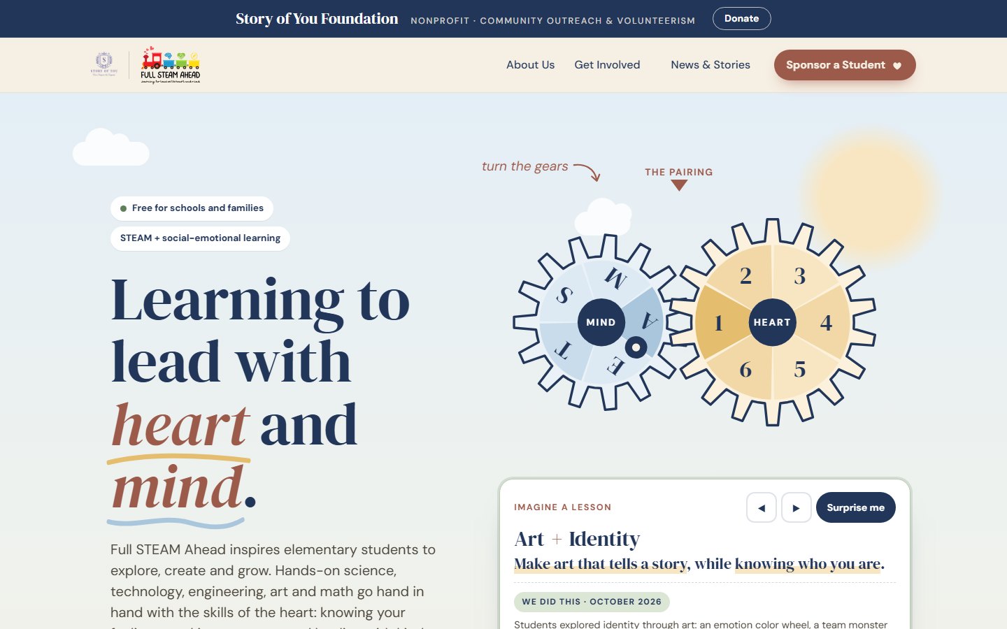
Two meshed gears pair the 5 STEAM subjects with the program's 6 social-emotional pillars, which gives 30 combinations. Drag a gear, use the arrows or press "Surprise me". When a pairing matches a real past event, a card shows what students actually did.
"Build the perfect playground": a team of four must agree on 4 of 6 materials, then build it on the sketch. It shows the program's mind half and heart half in one activity.
The S-T-E-A-M pennants flip on tap or with the keyboard, and the sixth flag is the heart, so the message lands without a paragraph.
Past issues sit as book spines on a shelf, with the latest one pulled out. It's an archive you can scan in one glance.
Transfers toInteractive onboarding and explainers. These are the same patterns as product tours and empty-state education, used here for teachers and kids.
The small interactions that make it feel cared for.
Nobody books a session because of a tilting card. But together, these details are why the site feels made for this organization instead of picked from a template gallery. Anything that moves respects reduced-motion settings. Each one has a short recording from the live site.
On the homepage doorways, the art cards tilt a few degrees toward your cursor, and a soft glow follows the pointer across buttons. It hints "this is clickable" without a single extra label.
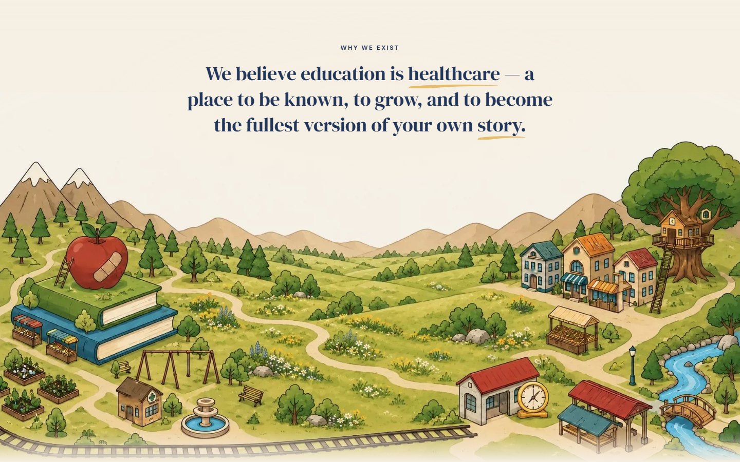
Wide screens only. Off with reduced motion.The illustrated world starts as a pencil sketch and fills with watercolor as you scroll through the section.
On phones and with reduced motion, it's shown finished.Full STEAM Ahead has a "Pause motion" button next to its animations, and the page remembers the choice on the next visit.
For visitors who don't set reduced motion in their system.Looping animations stop when their section scrolls away, so the page doesn't drain a phone battery in the background.
Press "All aboard" and the logo train rolls out and back. Tap a car to open a short card. Escape closes it and returns focus to the car you came from.
Picking a tutor fills in the booking page, and the booking page's service cards show the cost before you commit to anything.
Transfers toMicrointeractions and motion design with accessibility built in: affordance, feedback, and respect for user settings.
Nothing went live until it passed the same checks on every page.
For every change I checked the page at desktop (1440px) and phone (390px) width, with the brand switch on and off. I confirmed that no page scrolled sideways, and compared each new section against the live one so no link, image description or form went missing.
The organization's owner is the one who pastes changes into the site, so I also designed the handoff. Each page got a short guide: what to back up first, where to paste, the first and last line to look for so you know you copied everything, and how to check the result. One page per sitting, in a set order.
Transfers toRelease QA, cross-device testing and writing handoff documentation for people who aren't designers.
A brand kit works best as a checklist.
Designing the system was the easier half. Applying it across 38 pages, built at different times by different people, was the hard part. What kept it consistent was writing the rules as a checklist I could audit each page against.
What's still open: six illustrations of people don't match the kit's illustration style yet. Replacing artwork is the organization's call, so I documented which ones and why, and left the decision with them.